


The first beer can was sealed and sold in 1935. The originals looked like soup cans, and the art was simple: a few colors, an inviting font, and a company logo, which tended to look like a medieval coat-of-arms.
Microbreweries have changed all that. Brewers routinely invent wacky names, often based on personal references or unknowable inside jokes. The beer can becomes a ready canvas for graphic designers, and the artwork can be as colorful and surreal as the imagination permits. When a can is first laid out, the image looks flat, like an unfurled flag. To really appreciate the aesthetic expertise that goes into them, here’s a glimpse at some Rhode Island-based artwork – and the illustrators who dreamed them up.
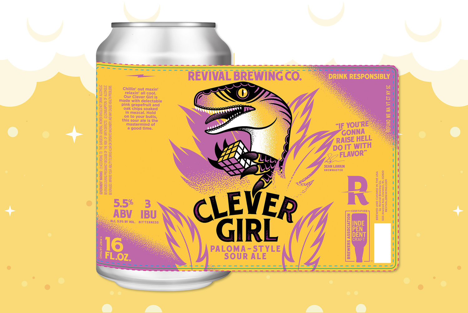
Beer: Clever Girl (Paloma-Style Summer Ale)
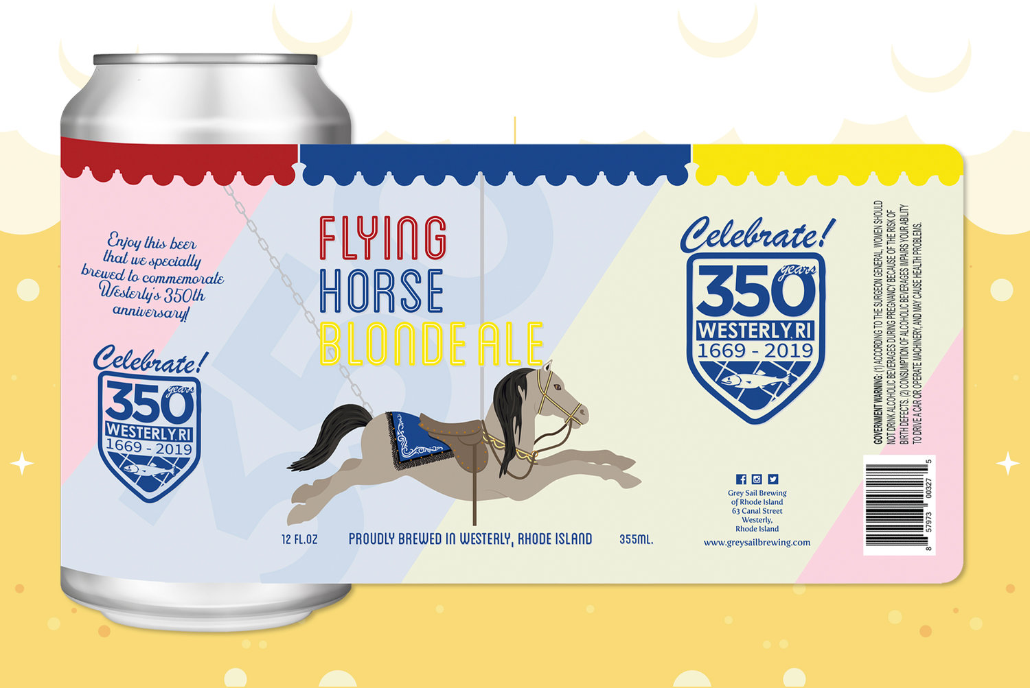
Beer: Flying Horse (Blonde Ale)
Artist: Kyle Reichman
Background: “The Flying Horse Blonde Ale label was created to mark the 350th anniversary of the town of Westerly. After doing some research we decided to use the carousel as the theme for the can as it’s one of the more notable landmarks of Westerly [Watch Hill], plus it’s one of the oldest in the country. We were able to incorporate a lot of the features of the horse and saddle as well as the detail in the trim that lines the top of the carousel. The town of Westerly provided the 350th graphic that is being used on their marketing material. The beer will be served at multiple events planned to celebrate the anniversary.”
Beer: La Ferme Urbaine (Farmhouse Ale)
Artist: Elizabeth Atlas Weisberg Chang
Background: “The con-cept behind La Ferme Urbaine, which is French for ‘the urban farm,’ incorporates some of my favorite things to draw – nature and architecture. As a city dweller, drawing plants and landscapes is almost an escape from the excitement of urban life. I am constantly seeking out lush green patches of earth to illustrate! The scene for this project playfully incorporates texture, pattern, and color helps the consumer feel enveloped in a rich environment.”


Comments
No comments on this item Please log in to comment by clicking here